

Table Of Contents
There are two ways to increase the volume and quality of leads coming from your website:
You can drive additional qualified traffic, or you can improve the effectiveness of the traffic you currently hold.
Conversion Rate Optimization focuses on the latter.
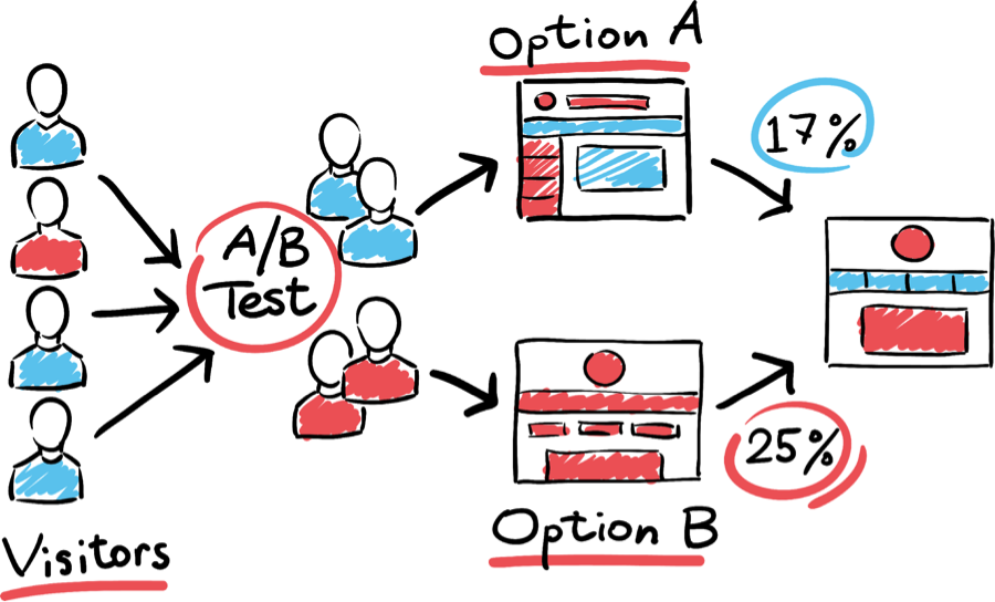
The practice of Conversion Rate Optimization (CRO), deals with increasing the percentage of website visitors who take a certain action on your website:
A few examples would be:
- Filling out a form
- Making a call
- Downloading a whitepaper
- Subscribing to a Newsletter
- Making a Purchase
This process involves understanding how users navigate your site, and what’s inhibiting them from completing your goals.
Start optimizing your conversions now!
Get a FREE Growth Strategy Session with a OneIMS strategist:
What makes conversion rate optimization so essential?
Increasing traffic to your website is difficult and expensive, so when there’s opportunity to generate more sales with the same amount of traffic, it’s best to take advantage.
Rather than sink more money into PPC Ads, SEO, or other digital marketing methods, you can instead capitalize on the traffic share you currently have. If there did come a time where you were looking for more traffic, your CRO efforts will pay off exponentially.
Let’s look at a couple case studies:
Experimenting with the color of the main call to action button increases conversions by 20%
The company Performable (now Hubspot) tested their homepage CTA button with both green and red colors (while keeping all else the same)
Even the smallest details can make a difference, as colors evoke different emotions to the majority of users. In this situation, around 20% more people clicked on the red button over the green.

But why?
You can make arguments that red is more of a stop and take action color than green, but be careful when making changes to your own pages.
Colors may be represented differently on your landing pages, so make sure you test your pages with your audience and see what happens.
Setting Up Live Chat Improves Conversion Rates by over 200%
The company Inuit set up a live chat system as an alternative means for users to convert. On their checkout page, conversions went up 20% and the average order value increased by 43%.

By adding live chat to the product comparison page, sales were boosted by 211% from the proactive chat window alone.

There are no restrictions in terms of what you can add/takeout/modify to improve conversions. Don’t feel limited to the standard A/B testing that exists with images, colors, CTAs etc..
Live chat is an extremely valuable tool for those who want their questions answered immediately.
People are becoming less and less patient as they browse the internet, so allowing visitors to immediately get in contact has a powerful impact.
So How Do You Start with Conversion Optimization?
Let’s dive into the steps:
- Know What To Optimize
- Run The Experiment
- Analyze the Data & Allocate Traffic Toward What’s Working
- Choose More Experiments To Run
1.) Know What To Optimize
Similar to many aspects of life, you have to identify a problem at its most basic level. You must identify the bottleneck, and determine why it slows down users from converting.Let’s look at a few scenarios:
Scenario 1) You wrote a blog post and would like to understand how it’s performing in terms of user activity. You pull up Google Analytics and see the data below.

The blog gets a fair amount of traffic (35% of overall web traffic), but has a 96% bounce rate with average session duration of 13 seconds.
The question/problem here is:
How can we increase engagement on our blog posts?
Scenario 2) You receive a fair amount of traffic to your home page but are curious if the people are moving forward with requesting a consultation.

It looks like a fair amount of people are converting, but there is definitely room for improvement with only a 1% conversion rate.
How can we get more people to request a free consultation?
The next step is to formulate a hypothesis that is testable. For this part of the process it is important for the hypothesis to be specific and measurable.
Here are some examples of hypotheses that are applicable to Conversion Rate Optimization.
If I embed a lead magnet into my content, I will increase the overall opt-in rate of blog traffic.
If I move the Request For Proposal banner ad above the fold, I will increase the rate at which people hit the contact page.
Learn how you can get the most conversions.
Get a FREE Growth Strategy Session:
2.) Run The Experiment
There are a few different types of tests you can run depending on the problem you’re trying to solve. See Google Optimize for more information regarding the conversion rate optimization tests that are available for your landing page.Use that information to choose which test will serve the needs of your conversion rate optimization hypothesis.
On top of this there are two things to keep in mind:
The test should run for a minimum of 1 calendar week
Typically you’ll run tests for much longer but 7 days takes into account traffic variations that occur daily, as well as weekday/weekend traffic differences
Continue Running Your Test Until There’s a 90% Chance to Beat Your Control
It can be tempting to end the test sooner if you see conversion improvement through a specific variant. The longer you run the test, the more sure you’ll be that the improvement is statistically relevant. The smaller the improvement, the longer the test will need to run in order to be statistically significant. A test with a 10% improvement in conversion rate will need to run longer than a test with a 40% improvement.
3.) Analyze the Data
When analyzing results don’t get lost in the details by looking for improvements across many KPIs (click through data, scroll/click data, and other engagement information) – Do your best to keep things simple.The only KPI that matters in the end is which page variant converts more. Lets look at the experiment below.

What we see from the stats above is the new version (Variant Copy 1) had a 24% increase in conversions. The conversion rate for the test was 5.56% while the original was 4.46%.
The test is still young (only 580 visitors total to both variants), but the results are promising. Optimizing for conversions here are important, but if you really want to test to improve your bottom line, you also need to test those that follow through with a purchase.

It is possible you increased the number of conversions but decreased the value of those conversions overall. For this reason, you’ll need to measure all the way to the end of the sales funnel to get the most relevant and measureable results.
4.) Choose More Experiments To Run
Now that you have a pretty good idea of what conversion optimization is, and how it can help your site, it’s time to think about all of the stuff you can test. Let’s assume at this point you have gathered information by conducting user tests, interviewing your customers, and diving into Google Analytics.Now it’s time to come up with additional opportunities for testing, prioritize those opportunities and execute the tests accordingly.
Let’s look at a few tests below:
Headlines for Conversion Optimization
For starters, most headlines are poorly written. This is a problem because they’re an important part of every page and the first copy visitors read when visiting your website.
In an experiment from Visual Website Optimizer, Movexa improved their conversions by around 90% just by adding one word to their headline. They went from “Natural Joint Relief” to “Natural Joint Relief Supplement.”
Just that small difference led to a huge change in the success of their landing page.

Call To Action Buttons
The slightest tweak in your call to action can make all the difference. Every CTA should be considered a mission critical conversion goal, as every extra click can potentially mean more money in the bank.
Here’s an example of a B2B site that changed one word in their call to action and generated a 38% increase in conversions.

The answer here lies in the messaging. The word “Order” talks about what you have to do rather than the value you will be receiving. This CTA on its own could be much better, but this test was a step in the right direction, and an example of the power of even the smallest word changes.
Content Length
We all know that nowadays-long form content ranks better, but what sells better?
It depends.
Some businesses require longer content to explain their product’s value and how it works. In other cases, more straightforward products could benefit from shorter copy that gets to the point.
Without testing you’ll never know, but when looking at content length here are a few considerations.
- Expensive products need more content. A major purchase requires more consideration and research — therefore it commands more copy.
- Complicated products need more content. If the product isn’t straightforward and easy to understand make sure to write plenty of educational content to explain all of the important features and value.
- Zero Standing products need more content. Products with little reputation or standing will need content to respond to customer objections. Are customers concerned about quality or price? Identify any possible objections and make sure to write about them accordingly.
Testimonials
Reviews and testimonials are a staple of conversion rate optimization because they allow you to say things you couldn’t say otherwise.
It is important to make sure your reviews are realistic, emphasize business value, and are placed properly on your landing pages. When it comes to reviews:
Text is fine.
Images are good.
Videos are best.
Text-based reviews aren’t the only tool at your disposal. Pictures of the reviewer and a link to their social profiles can make the review seem more realistic – but a video provides a rich testimonial that fully captures customer satisfaction.

You can check out all of the video testimonials for OneIMS here.
Get more conversions and make the most of your website.
Get a FREE Growth Strategy Session with our experts.
Now that you know how to use conversion optimization to help your business, let’s look at:
11 Additional Techniques To Help Get The Most Out Of Your Traffic
1.) More Landing Pages
You probably understand why landing pages are important, but how many are you creating? Hubspot ran a report looking at the connection between the # of landing pages and its impact on lead generation.
It looks like companies don’t see an increase with landing pages in the 1- 10 range, but companies begin to see real increases after creating 10+ landing pages.
More landing pages offer more opportunities for users to end up on your website and convert. Make sure the landing pages are unique and offer distinctive value
If you have 10+ landing pages with plenty of different offers and calls to action, you have created much less friction which could inhibit users from navigating the site and digesting your content.
2.) Replace Blocks of Text
Content shouldn’t be written in the way that you were taught in high school (4 sentences in a paragraph and few headers). These days people skim content and refuse to read huge blocks of text, so make sure to space out your text as best you can.Here are a few pointers that help make your text optimal for modern readers:
- Terms – use simple wording
- Lists – use bullet points
- Headers – Utilize your H1s – H6s
- Non text communication – videos, images, infographics
Designers are moving toward lengthier pages with less content to scan all at once.
As a user scrolls, they can easily take in information at their own pace.
3.) Evoke Emotion with Loss Aversion
Loss aversion is the most powerful psychological motivator. People are more likely to act against negative consequence over a positive stimulus.This can be applied to how we frame our product offerings. Goodui.org poses a great question:
“Do insurance companies sell the payout that can be gained after the accident or the protection of things that we hold dear?”

Outlining the product as protective of your customers’ overall well being is more powerful than trying to provide value that a customer does not already have and has never known.
4.) Engage New Users
Allowing users to convert in multiple ways on your website is best practice for generating opportunity from new users.
If the only options on your website are to purchase, or to fill out a long request-a-quote form, you’re alienating customers who are earlier in the decision making process.The idea is to keep users engaged without asking them to buy or sign up first.
Some of these options include:
- Watching a video
- Downloading a free trial
- Engaging in live chat
- Taking a quick quiz
The Conversion Rate Experts have a great case study backing up this strategy through a company called PhotoShelter. This company has a free version that wasn’t particularly effective, but users who tried the paid version were likely to continue using it.

Therefore, they created a paid version through a no-risk trial for $1. This new version was much more popular for visitors than the “control.”
Another way to create more opportunities for conversion is using the growth tools through Clickx.

Here you can utilize the lead from and welcome bar to promote eBooks, promotions, or other top of funnel conversion opportunities such as “Have a Question” or “Chat with us.”
5.) Keep Your Most Profitable Products Above The Fold
Product placement is extremely important because the content above the fold is what is immediately visible when users load the page.Most web designers are in agreement that the average fold line is about 1,000 pixels wide and 600 pixels tall.
Below is a graph from Neilson conducted analyzing the percentage of users that scrolled below the 2,000 pixel mark.

Depending on the user, some will purchase from your website without going below the fold, so it is important to highlight the most important products first.
Important Note:
Take this tip with a grain of salt, because scrolling has becoming more and more a part of the user experience ever since mobile users surpassed desktop. Users don’t mind scrolling as much nowadays, and it is much more easily tolerated than clicking through multiple pages. If your website is set up with design best practices in mind, then you shouldn’t have a problem encouraging users to scroll and engage with your website.
Our experts are here to help.
Get a FREE strategy session with our team of digital strategists:
6.) Competitor Comparison
Unless your products are extremely unique, it can be helpful to directly compare your value over competition. Most of the time you’re going up against companies that have more funding and bigger teams, making conversions expensive and hard to come by.
A popular way to persuade users is to embrace the competition with a direct comparison chart on your landing page.
You would be surprised at the number of companies that put zero effort into comparison marketing and reputation management, leaving paying customers on the table.
Depending on the business, there are a few opportunities to highlight your value:
- Quality/Durability
- Benefits
- Customer Service
- UI/UX (SaaS companies only)
- Price
- Target Vertical
- Integrations (SaaS companies only)
One of the most common ways to portray a competitor comparison is in a table format. The below table compares formstack with similar platforms by directly comparing its features with the rest of the pack.

For additional ways to portray a comparison, check out the comparison page article by Megan French.
7.) Utilize Usability Testing
This CRO tactic involves retrieving feedback from real time users as they navigate around your website. With this method you utilize real-time feedback on what site attributes are slowing users down or inhibiting them from seamless navigation.Lets highlight some of the key values that usability provides over other CRO methods:
- Can be done with an unfinished site – The beauty of usability vs. something like A/B testing is that your site doesn’t need to be live – you can test at any stage of the design/development process.
- No Need For Sample Size – Most CRO methods require hundreds if not thousands of visitors to generate proper insight whereas usability can be done with an extremely small number of people.
- Understand The Emotional Response – Usability allows for fast detection of issues. Most methods will tell you that A is better than B, but usability will tell you Why, How, and What is causing a certain action. It provides a more holistic image of the situation at hand (this is where data alone falls short).
These tests themselves can be fairly simple, yet it gives loads of insight on how real users explore and discover your content.

8.) Stay Away From Stock Photos
Human beings respond to other human beings – Real people that they can relate to and understand. Most companies would rather not put in the work and resort to stock photos that look irritable and staged.Many experiments show that these images are ignored by people and allow them to view the site but not experience it. The idea is to make sure your images add value to your website, not just pictures that “look pretty.”
Below are a couple of research papers from peer reviewed scientific journals that analyze what human photos do on websites.
Shiny happy people building trust?: photos on e-commerce websites and consumer trust (Credibility of sites can be boosted by employee photos).
Exploring Human Images in Website Design Across Cultures: A Multi-Method:
(Websites with images involving facial characteristics are better received by people than images with no emotional features).

There are countless studies that show people make connections with other people. The photo’s impact will depend on the theme of your website, so it is best to A/B test different photos and even try out no photos at all.
“A thing that you see in my pictures is that I was not afraid to fall in love with these people.”
— Annie Leibovitz
9.) Use Symbols to Establish Trust
There is an epidemic of untrustworthy, and deceitful businesses that exist today, so it is key to separate yourself form the pack. Even a shred of doubt about the legitimacy of your business can tank conversion rates, so something like social proof symbols can be a good preventative measure.Let’s look at a few examples of popular trust symbols used by businesses today:

The badge above is in reference to the Better Business Bureau, an old and popular organization that focuses on establishing and improving trust in the marketplace. The BBB screens businesses that pledge and adhere to the code of BBB’s business practices.

The Norton Secured Seal is a trusted mark that can be utilized by Ecommerce platforms to portray dedication to online security. The seal is a visible image that shows the store was vetted for PCI compliance. These sites must authenticate their identities and encrypt all transactions in order to protect customer data.

Avvo is an online legal services marketplace that provides lawyer information and legal help. There are a variety of different badges and symbols that allow you to show off your Avvo presence as an attorney.
You can check out hundreds of badges and icons on the internet that can help establish credibility for your website, blog, or online store. There are several case studies that show these trust symbols boost conversions and push business growth.
10.) Unique & Emotional CTA’s
Not sure why your visitors aren’t following through with signing up for your newsletter or submitting a demo request? If your submit buttons still contain generic terminology (sign up, submit, join now etc.) you are just like everybody else.The call to action is a key ingredient to any effective marketing program.
Make sure to keep in mind these 3 factors when building a CTA:
- Placement (Where) – Make sure CTAs are displayed prominently and on every page of your website. Place them strategically so that your CTAs don’t cannibalize each other.

- What it Says (Copy/Text) – The key here is be clear. It is important to be creative and to hit emotional triggers, but make sure not to overthink your text. The user must know exactly what will happen once they click that CTA button because people like to know what they’re getting into.
- What it Looks Like (Design) – This is perhaps the trickiest part of any CTA. A successful design requires a delicate balance between aesthetics, SEO, and conversion optimization. Make sure your design is recognizable and a well-defined integral element of the page.
It is key to implement a stark outline using contrasting colors or negative space so that your CTA stands out. This provides emphasis for the CTA and gives it the breathing room it needs to appeal to users.
See a great example below:

10.) Unique & Emotional CTA’s
Not sure why your visitors aren’t following through with signing up for your newsletter or submitting a demo request? If your submit buttons still contain generic terminology (sign up, submit, join now etc.) you are just like everybody else.The call to action is a key ingredient to any effective marketing program.
Make sure to keep in mind these 3 factors when building a CTA:
- Placement (Where) – Make sure CTAs are displayed prominently and on every page of your website. Place them strategically so that your CTAs don’t cannibalize each other.
- What it Says (Copy/Text) – The key here is be clear. It is important to be creative and to hit emotional triggers, but make sure not to overthink your text. The user must know exactly what will happen once they click that CTA button because people like to know what they’re getting into.
- What it Looks Like (Design) – This is perhaps the trickiest part of any CTA. A successful design requires a delicate balance between aesthetics, SEO, and conversion optimization. Make sure your design is recognizable and a well-defined integral element of the page.
It is key to implement a stark outline using contrasting colors or negative space so that your CTA stands out. This provides emphasis for the CTA and gives it the breathing room it needs to appeal to users.
See a great example below:
11.) Make it Too Easy To Opt In
Rather than use a classic opti-in with a few different fields you can test out a 1 step opt in.
It is often better to have an opt-in form on the landing page itself, rather than a CTA that leads to a landing page. According to multiple marketing experiments 1 step opt-in performed 166% better than a 2-step opt-in.
There is an ongoing fight between sales and marketing personnel regarding how many form fields to add to the main forms on your website.
Sales people want as much information and as many fields as possible in order to provide greater visibility on the details of the lead.
Marketing professionals prefer fewer fields as not to deter users from inputting their information and bouncing off the landing page.
It is important to remove those unnecessary form fields and only include what the sales team considers absolutely necessary. By removing four fields, NoRiskSEO saw a 60.18% increase in client conversion rate.
Need extra help getting those conversion numbers up?
Get a FREE Growth Strategy Session with our digital strategists:


