Over the past few weeks, you may have noticed a few changes here at OneIMS.
Why, yes, we have been working out. Thanks for noticing.
But the other big change is right there in the top-left corner of your screen—our new logo.
Of course, a new logo design isn’t really just a new logo design. Not at all. It’s a rebranding, and a redefinition of how a business represents both its values and what it provides.
So, then, what does a logo mean? How does a graphic design team use a few shapes and lines to communicate a company’s values? Come on and take a closer look at our process.
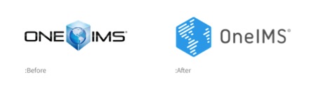
One of the chief priorities for our design team was to retain a sense of continuity between our old logo and the new. The idiosyncrasies of the old design—the high level of detail, the color gradient, the shape—put limits on its versatility. Updating the logo rather than replacing it would amend the design while maintaining a sense of visual continuity and paying respect to our roots.
The team agreed that a simplified, flat, modern design would be both an aesthetic and a practical improvement, allowing for more varied uses of color, easier applications in other mediums, and text-free use.
While the former logo design relied more heavily on the surrounding text, the new image is more distinct and iconic, making it considerably more versatile.
So the logo makes aesthetic sense, but what about philosophical sense? Every logo tells the story of its brand, and that’s a lot of pressure to put on something so small.
The web has made the world smaller, and we wanted our logo to communicate the idea that global connectivity can be simplified. With its abstract, rounded lines, the design suggests that the world can be yours, wrapped up in an simple package—everything you need, uncomplicated—a perfect fit for our inclusive services.
Ultimately, the logo design is only one part of a much bigger, more complex sense of identity.
In addition to reimagining the logo, our graphic design team developed an aesthetic that would carry over throughout other marketing materials, as well.
Read more about our logo transformation at
In The Art of War, ancient Chinese military strategist Sun Tzu famously commanded his generals…
A robust digital marketing strategy is essential for businesses to thrive. The HubSpot CRM Platform…
Connecting with today’s buyers is more challenging than ever. They’re looking for credibility, reliability, and…
Is your content pulling its weight? Content marketing is no longer optional—at least, if your…
Is there anything worse than staring at a blank page? Whether you call it writer’s…
Imagine having a powerful tool that not only captures attention but guides your audience seamlessly…